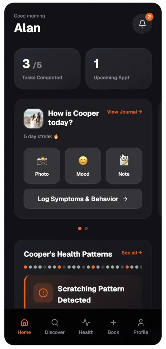
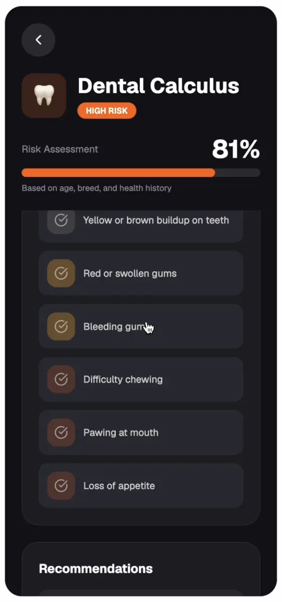
The owner app
Logging, journal, care plans. Dark mode only.
Pointer had a predictive model and a prototype built by its CTO. I redesigned it into a product vets trust and built its design system. A six-person team is now building it from my concept.
“This is from my vet, this isn’t just some random app.”Partner veterinarian, testing the prototype
Given: Pointer’s logo, two colours and two typefaces came from their brand guide, and the marketing site isn’t mine. The product system built on top of them is.
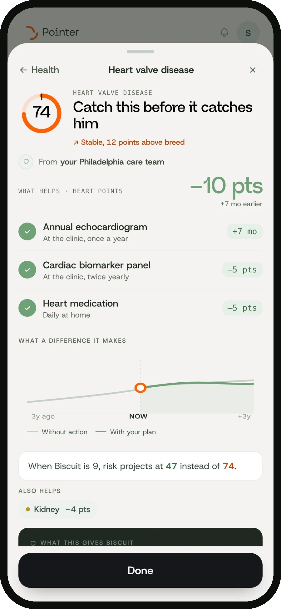
The forecast worked, but only the team could read it.
One rule: every risk comes with an action. Prototyped with AI on a design system I built.
Vets tested five versions. The clinic note, actions first and one alert colour are what’s being built.
The client. Pointer forecasts a dog's health risks years before symptoms, from its vet record and breed. Owners get it free through their clinic.
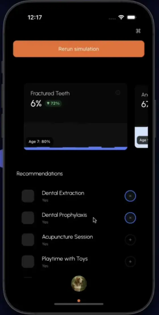
Percentages, a chart and a list of treatments to toggle. Accurate, but hard for an owner to act on.
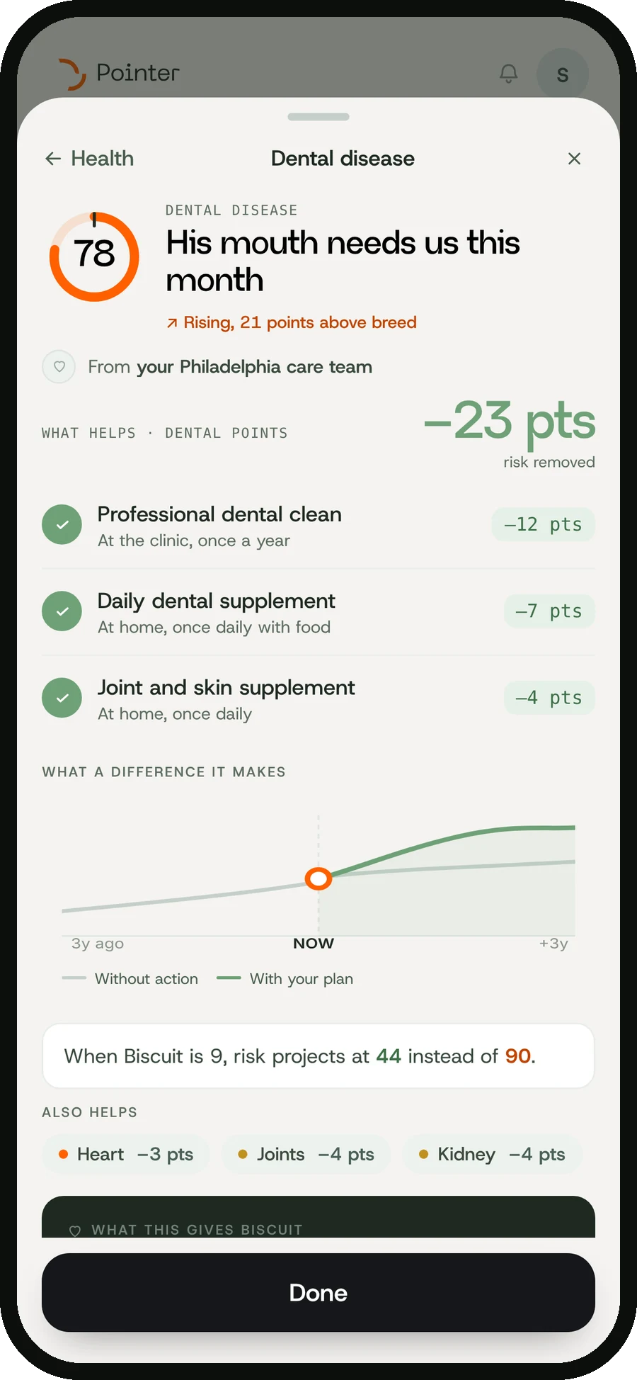
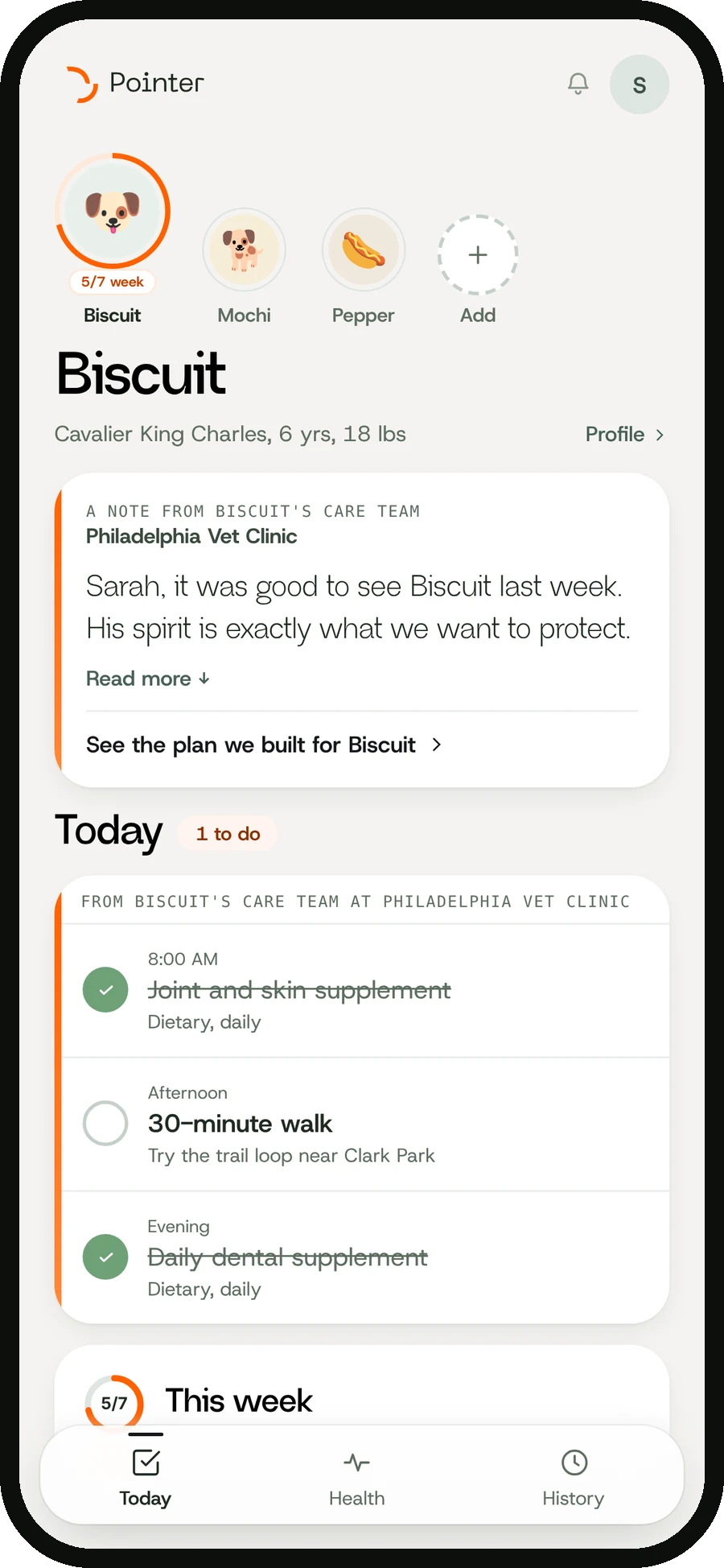
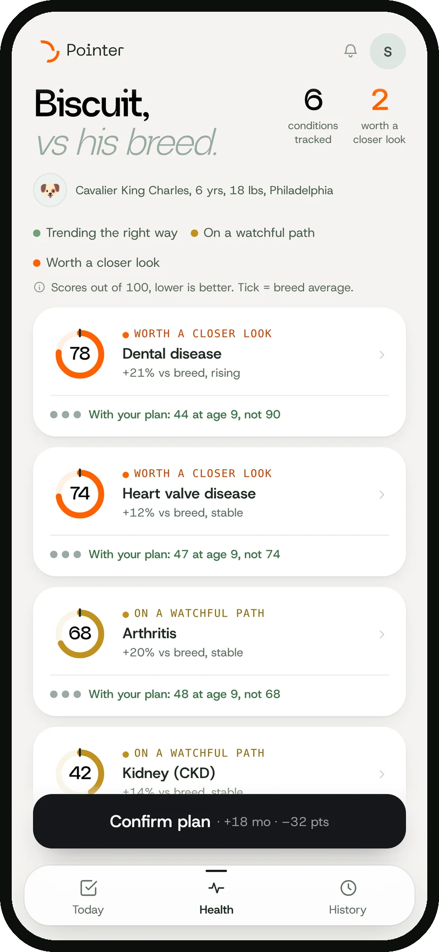
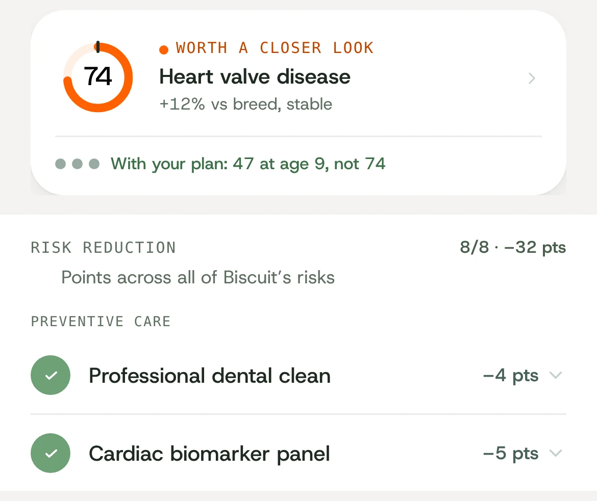
One risk explained in a sentence, three actions ranked by impact, and the curve they change.
From dark dashboards to a light app led by a note from the clinic.
Logging, journal, care plans. Dark mode only.
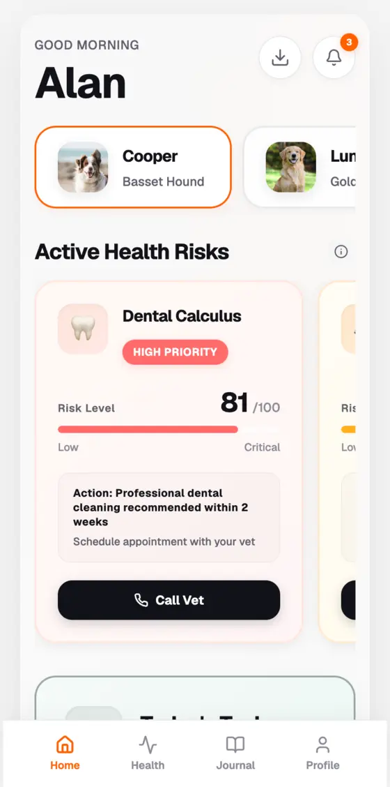
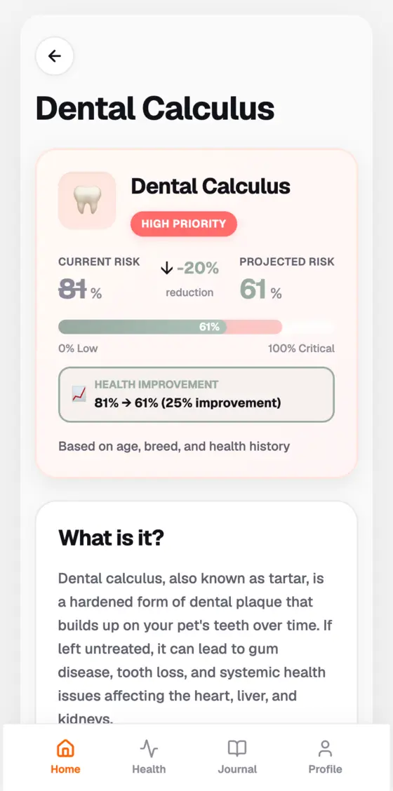
Light became the default. Dark mode stayed supported.
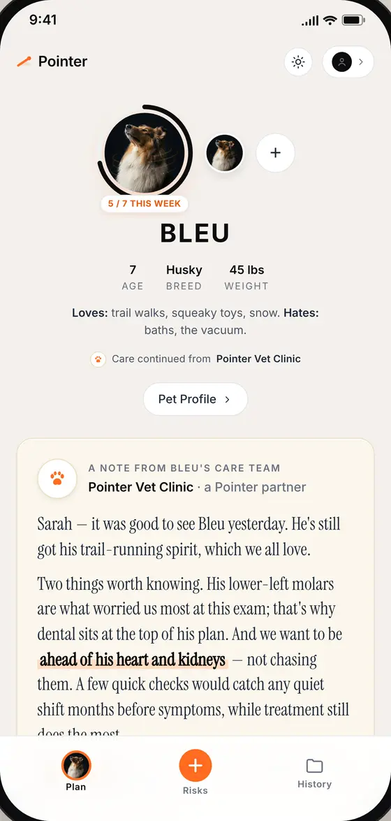
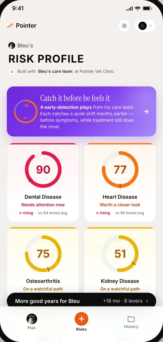
The version vets and partners walked through.
Sage system, actions first, plain words, no all-red profiles.
Every version went to vets: a partner vet, a co-development group and an industry advisor.
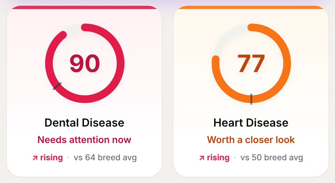
Team's direction: a different alarm colour per risk. Tested with vets and clinic partners.
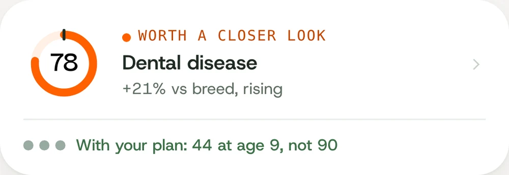
One alert colour: orange. Everything else stays calm, so the one thing that needs attention stands out.
"You're providing them something a veterinarian has never been able to provide."
Co-development partner"If my pet's profile is all red, I kind of feel like a bad owner."
Clinic operationsA forecast, a plan from the clinic, and how the plan changes the outlook. Working prototypes, not mockups.
I designed the structure and decisions, then used AI to build working prototypes on the design system.
From a logo guide with two colours and two typefaces to a product system the AI tools used with every prompt.
A full scale from each brand colour. Every neutral comes from these two plus white. Fills use the 500s, small text uses the 700s so it passes AA.
Every tier has a colour, a dot and a phrase, so the meaning never rests on colour alone. Orange means look closer, green means done or on track, and actions are black.
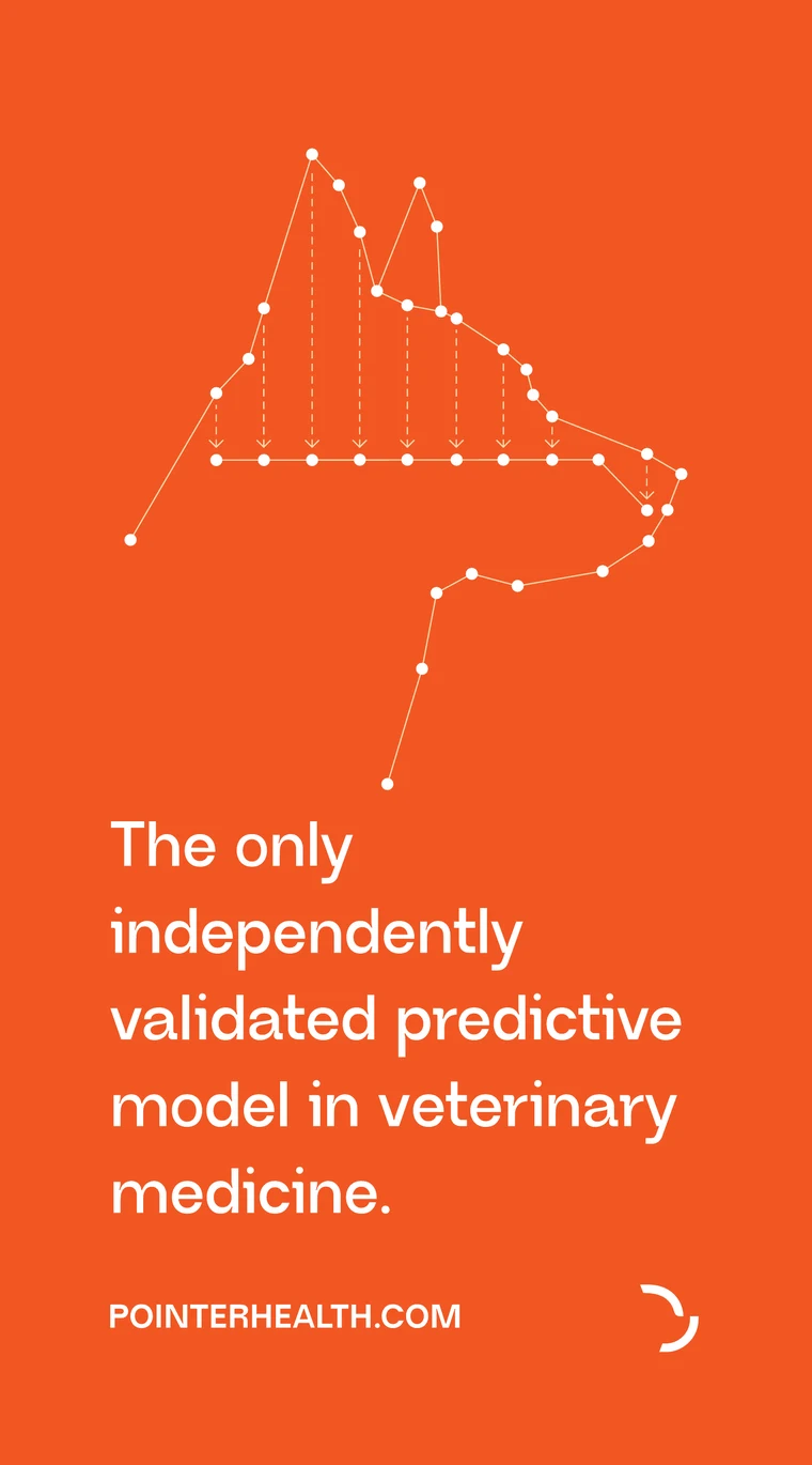
The AVMA stand banners use the same ramps and type as the app.
/* Pointer — Design Tokens · prefix --ptr- */
--ptr-g-500: #98AAA1;  /* ★ anchor · Moss Green */
--ptr-o-500: #FF6000;  /* ★ anchor · primary CTA */
--ptr-canvas-green:  var(--ptr-g-50);
--ptr-surface-card:  #FFFFFF;  /* L2 lifts off L1 */
--ptr-o-text:        #C24400;  /* 5.1:1 on white */
--ptr-g-text:        #3D7048;  /* 5.8:1 */
--ptr-f-display: "Neue Regrade";
--ptr-f-sans:    "Host Grotesk";
A tokens file and a component stylesheet (cards, rings, plan items, pet switcher, navigation), handed to Claude Design with every prompt.
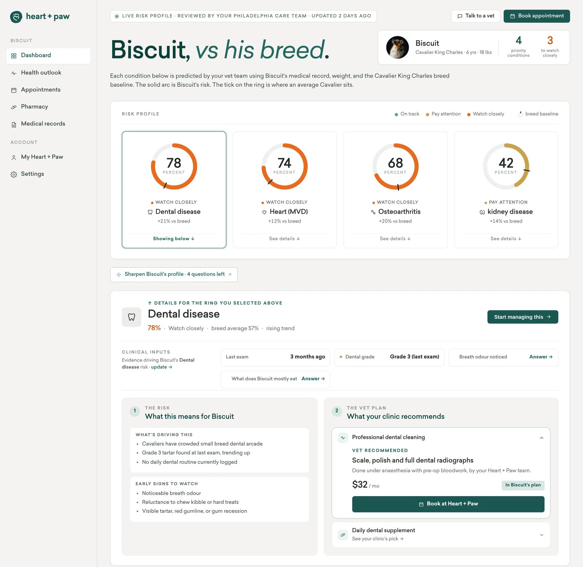
Pointer's risk profile and care plan had to live inside a partner network's dashboard, in their brand, keeping their own labels and score format. I turned their UI into a design system and fitted Pointer's features into it.
For two AVMA conferences I designed the stand, a pilot brochure, the founders' keynote, clinic print and a welcome box. Every dog is generated with Nano Banana in one art direction.
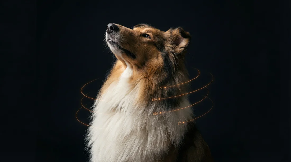
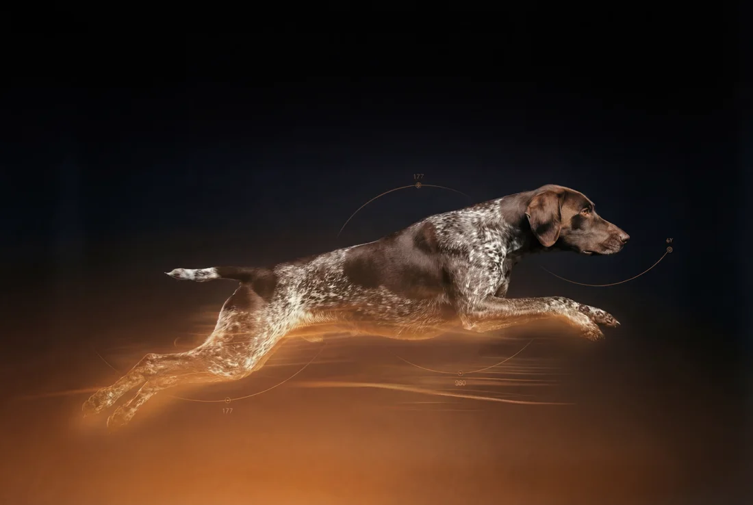
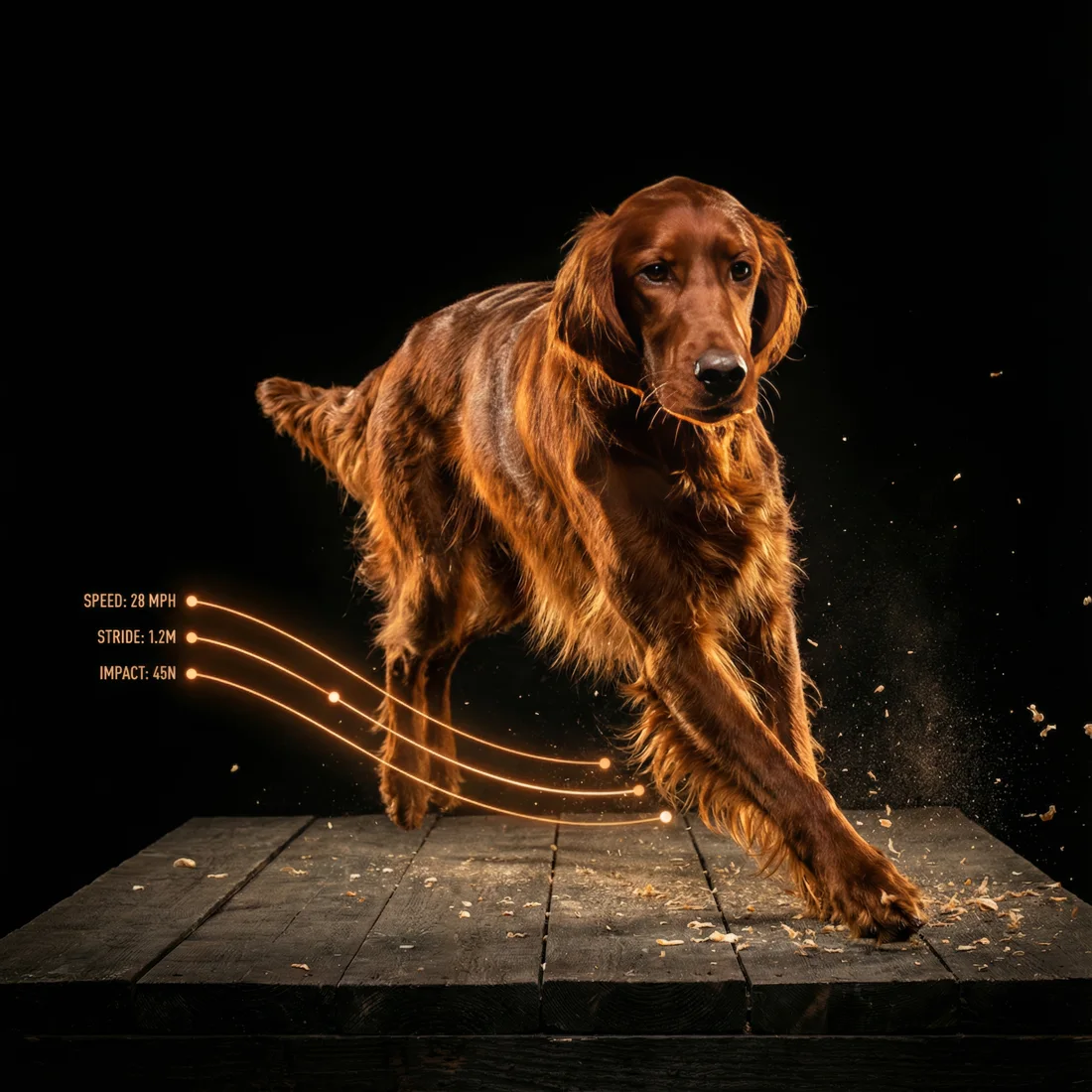
Nano Banana · one art direction for every dog
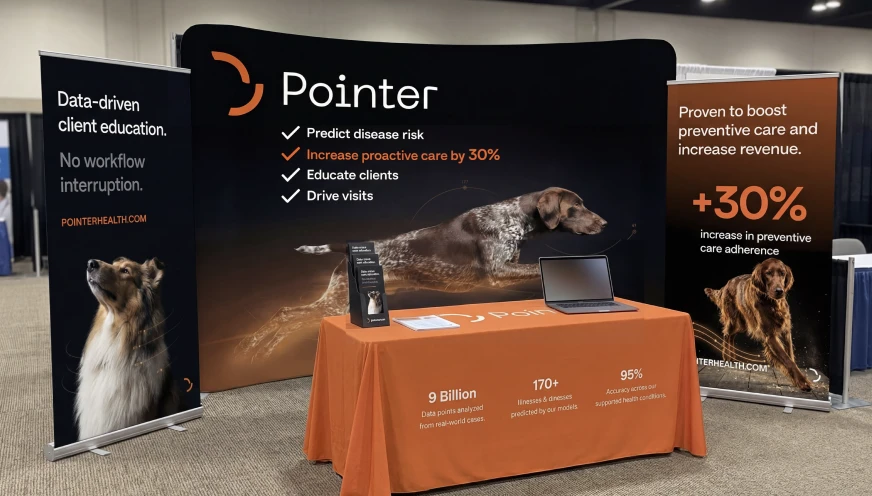
The clinic speaks first. Actions come before charts. One alert colour.