One designer to a funded team, one system for every Cognite app.
Cognite makes industrial data software for oil, gas and energy: 18 product teams shipping 11 apps on one platform. Cogs started in 2019 as a small code library one developer built for his own team. I turned it into the company-wide design system, replaced Ant Design with it, and made the case to management that got it a team.
Given: Cognite’s brand palette and typeface. Turning them into one system for every product, and running it, was mine.
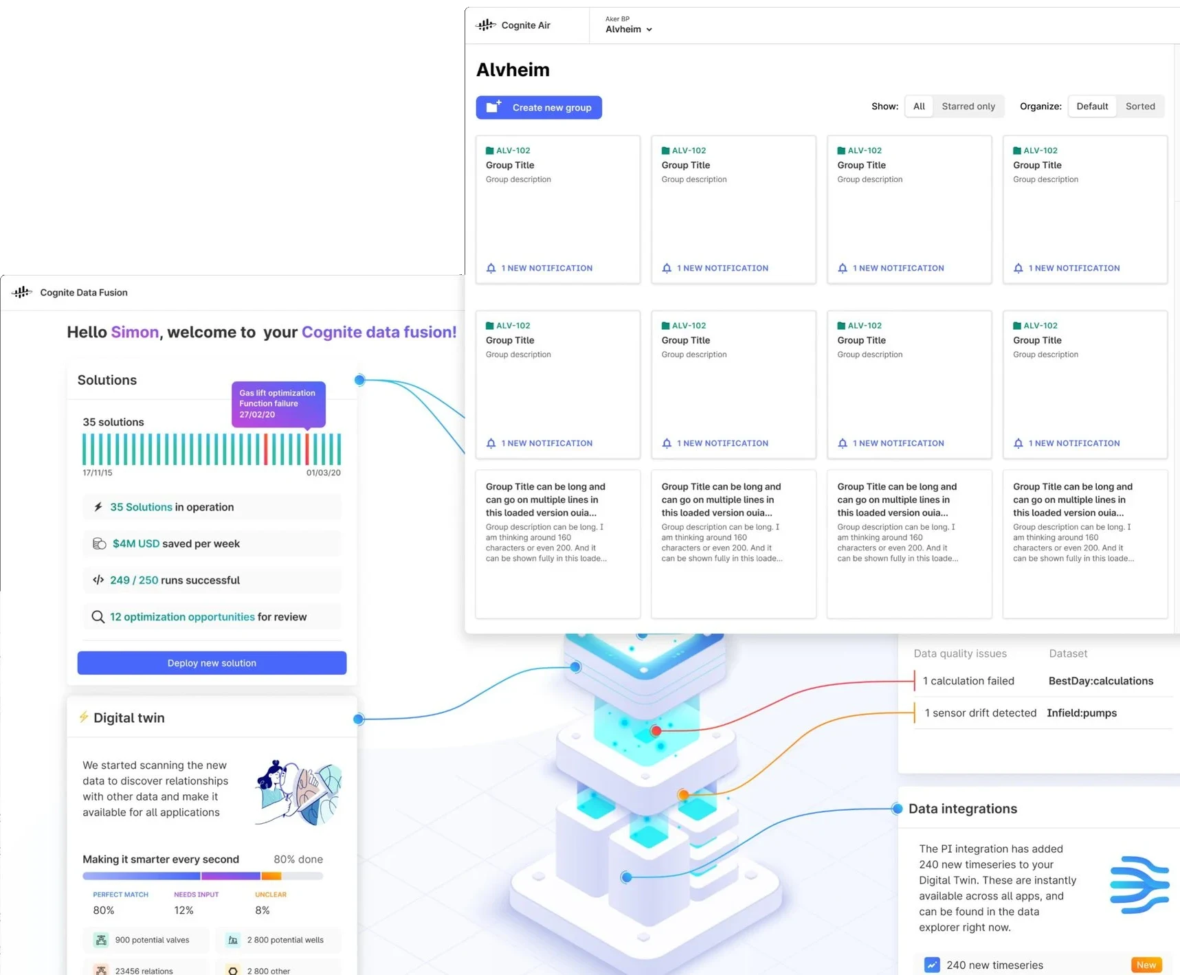
Data Fusion and AiR on one visual language: the same topbar, buttons, segmented controls and tabs across separate teams and codebases.
Every team built its own UI on Ant Design overrides. One platform looked like many products.
Ran the system as a product: roadmap, one release workflow, docs, contribution and support.
Button and Topbar in 9 of 11 products, and a full-time core team after my staffing case.
Replace Ant Design, don't theme it.
I started with the five components on almost every Cognite screen: Button, Topbar, Tenant selector, Segmented control and Tabs. Shipping those changed every product at once.
Why. Ant Design's look and component API belong to Ant. Theming changes colours, not structure, so every app kept its own overrides and drifted further apart. Owning Cogs.js meant one API in Cognite's brand, with Figma and code that match one to one.
The cost. Teams migrated screen by screen. Drop-in components moved fast; components that forced screens to be reworked moved slowly.
The resistance. Developer time. Product teams always put their own roadmap first, so system work kept slipping.
I wrote the memo that got the system a team.
After a year I was doing the tech lead's job on top of my own: finding developers in #kill-antd, chasing unfinished tasks, and policing adoption across teams in DMs. I wrote management a one-page case: every task that belonged to a tech lead, the problem each one caused, and the fix.
Why do we need a Tech lead with a minimum 50% allocation?
“Short answer: Stef is not going to do the Tech lead's job anymore.”
- Assign dev work once design is approved
- Follow up on delivery and quality
- Plan releases with real estimates
- Be the developer voice that drives adoption
- Keep Storybook and the design docs in sync
One path from request to release.
Every request and bug went into one Jira flow. Design and code ran as two lanes, each with its own QA and docs. Reviewers came from other product teams, so no single team owned a component. The pipeline: Figma library → Cogs.js (React) → npm → every app, with the Storefront docs on top.
- All variants and states
- Dev spec page
- Overview, states, anatomy
- Accessibility, links
- Accessibility approved
- Reviewed by another team
- Storybook, unit tests
- Designers and developers told
- Monthly stakeholder update
“Higher priority is to release it, gain usage and gather feedback. We can always come back and make it better.”From the acceptance criteria I wrote for contributors
Measured per product, not guessed.
Anyone at Cognite could see the roadmap in Productboard, with a status per component and a usage record per product. Before that I tracked usage in a shared sheet; teams marked themselves when they switched.
Adoption of the first release, May 2021. Drop-in components spread fast; ones that forced screen rework spread slowly.
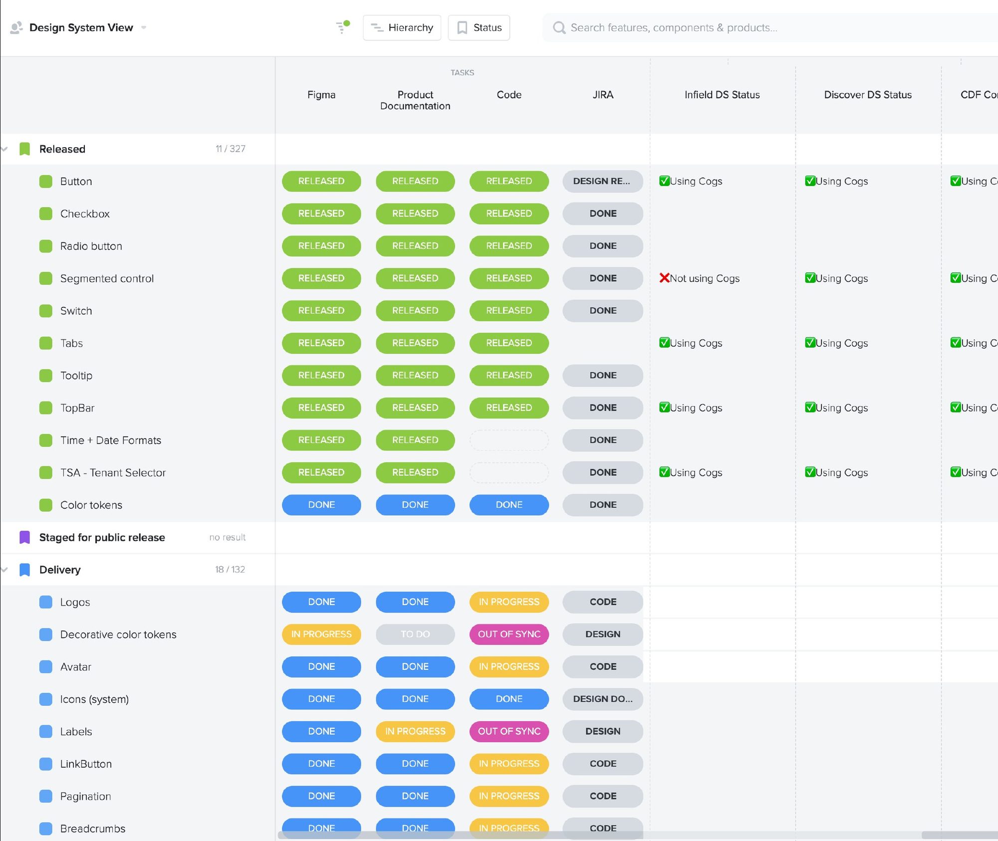
Productboard · the structure I set up: status in Figma, docs, code and Jira, next to usage in each product.
Support that scales to 18 teams.
Questions came in as DMs from everywhere. I moved them into one public channel and a weekly triage, then set three levels, so most answers come from the docs.
Self-service
- Starter files in Figma with guidance built in
- Storefront as the one place for design, product and dev docs
- Video tutorials and an onboarding deck
Customer support
- Public help channel with rotating captains
- Weekly open house
- Breakdown sessions with engineers
- Monthly onboarding for new designers
Direct support
- Pair designing with a product designer
- High-priority projects only
Every request in Jira starts with one of four categories, so triage takes minutes:
Figma_BugProduction_BugComponent_NewGeneral_FeedbackFigma, code and docs that mirror each other.
Every component lives in all three with the same name and states. Here is the Button in each.
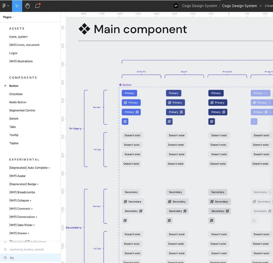
Figma library · the main component with every state and size.
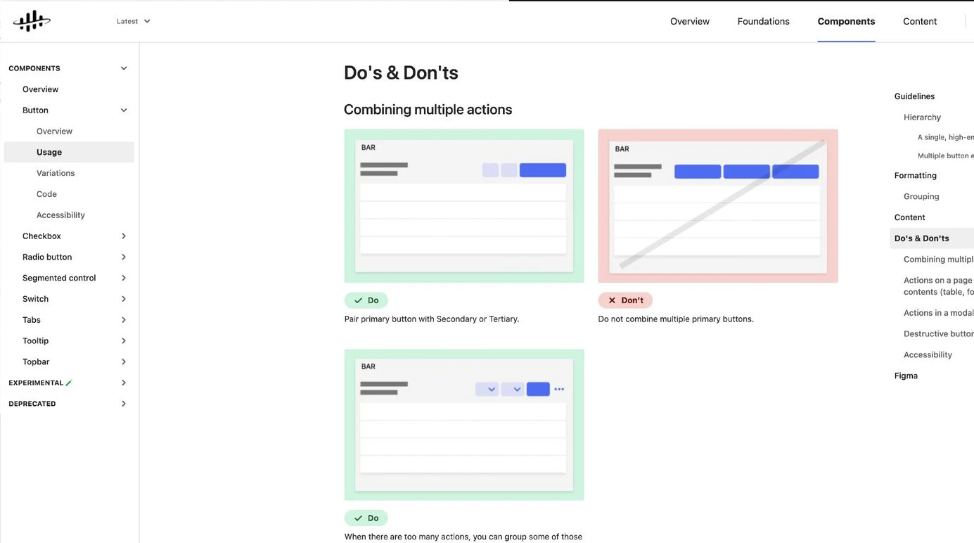
Storefront · do's and don'ts for each component.
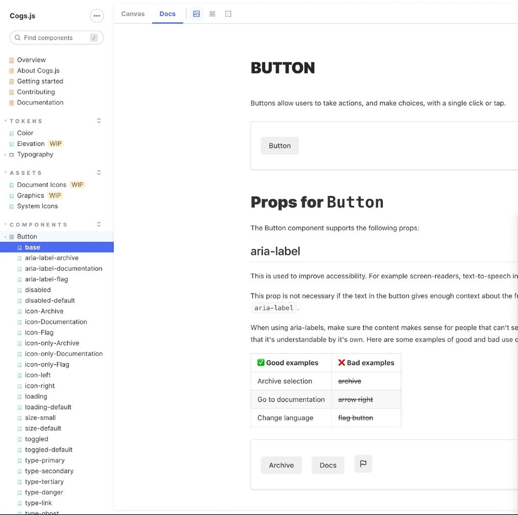
Cogs.js in Storybook · props, aria-label guidance, live examples.
Agreed in one workshop, before anything was drawn.
I ran a buttons workshop with every designer to agree on types and states before drawing anything. Below, the released components as a 2026 concept: same anatomy and variants, cleaner type, radius and focus states. The controls are live.
Button
Topbar
Tenant selector · Segmented control · Tabs
Asset Data Insight
Asset Data Insight
AiR, a new product built on Cogs.
AiR monitors equipment and raises alerts on time series. The AiR team owned the product; we worked with them to bring in the new buttons, segmented control and topbar.
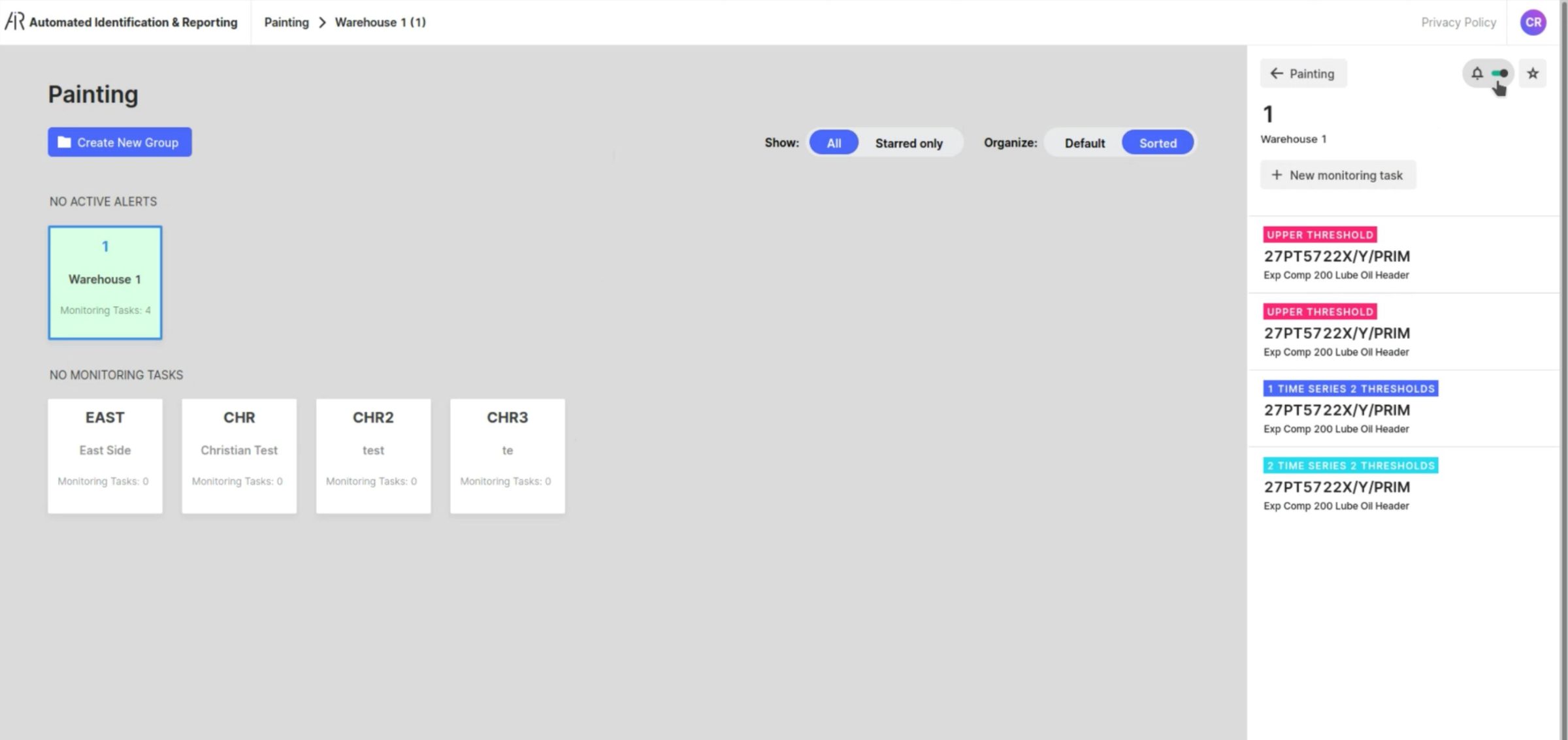
Custom pill toggles, two button styles, a one-off header.
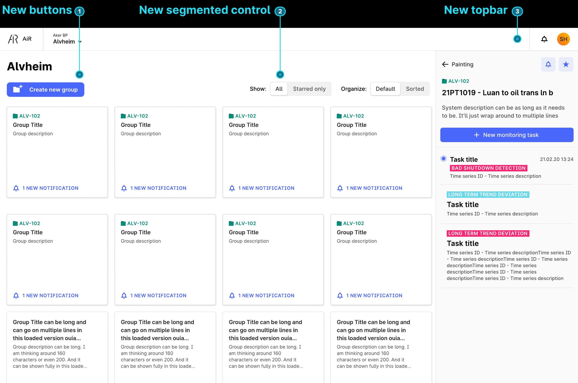
New buttons (1), segmented control (2) and topbar (3).
Alvheim
1Make the staffing case before the first release, not after a year of covering the gap myself. And plan migration support for the components that force teams to rework screens.
In 2022 I moved to product work on InRobot and Maintain and handed the system to a new design lead. By the end of 2022 five core design contributors gave it two days a month, Cogs reached release 8.0, and almost every Cognite product used it.
Also at Cognite: InRobot, results for inspection robots and Maintain, maintenance planning for oil and gas.