One design language for every team, then AI that works inside it.
When I joined Dailymotion there were no tokens and no structure. I taught the teams to build the system with me in Figma, we shipped five themes in light and dark, and when the brand changed we migrated to one theme. Then I made the system readable by AI tools.
Given: the palette, typefaces and visual style came from Dailymotion’s brand department, and changed with their rebrand. The token system, themes, components and process are mine, built with the teams.

Screens from the Apps 2.0 native kit, built on the Purple · Lime system.
No tokens, no libraries, no file structure. Every team improvised, and design and code spoke different languages.
Taught every team tokens hands-on, built five themes in two modes, then migrated to one after the rebrand.
Designers work on-system, apps and Studio run on it, and AI tools can read it.
No tokens. No structure. Nothing.
When I joined, there was no token system at all. Each team had its own files, live web pages sat next to “Old” versions, greys had names instead of values, and the native app alone had 13 kinds of button.
“Everything is hard-coded, no one uses tokens today.”A developer, in my token audit
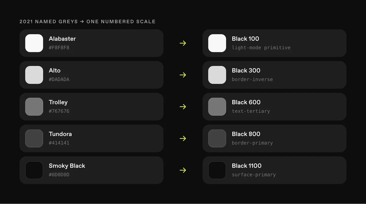
Before: greys with names, last updated in 2021. After: the same greys on one numbered scale, each tied to a semantic token. Concept view.
I taught the system before I scaled it.
Nobody had built tokens before, so we did it together, one step at a time. I stayed in each step until the teams could run it without me.
- Tokens in Figma, togetherbuild, commit, apply
- Librariesbuilt with each team
- File structurecleaned up, product files included
- Regular commitsfrom the teams, with my quality check on each
- Self-sufficient teamsmy job became new requests and moving with engineers
Alongside: the Ways of Working handbook for Figma and developer hand-off, and workshops on naming (46 components, voted anonymously), typography, colour tokens and priorities.
In my January 2025 review, the designers were using the system regularly.
Studio appreciated the cleanup of files: it sped up their process.Feedback from the Studio team, in the same review
Five themes, light and dark.
With one naming rule in place, from primitives to semantic tokens, we built five themes, each in light and dark, on one set of primitives and checked for contrast. “Alt” is the variant for small controls like checkbox, radio and switch.
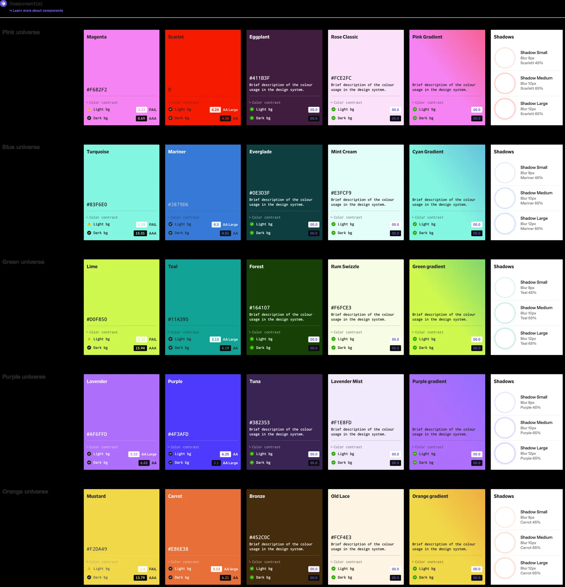
First · five themes, light and dark, on one set of primitives, each checked for contrast (Playground, 2023).
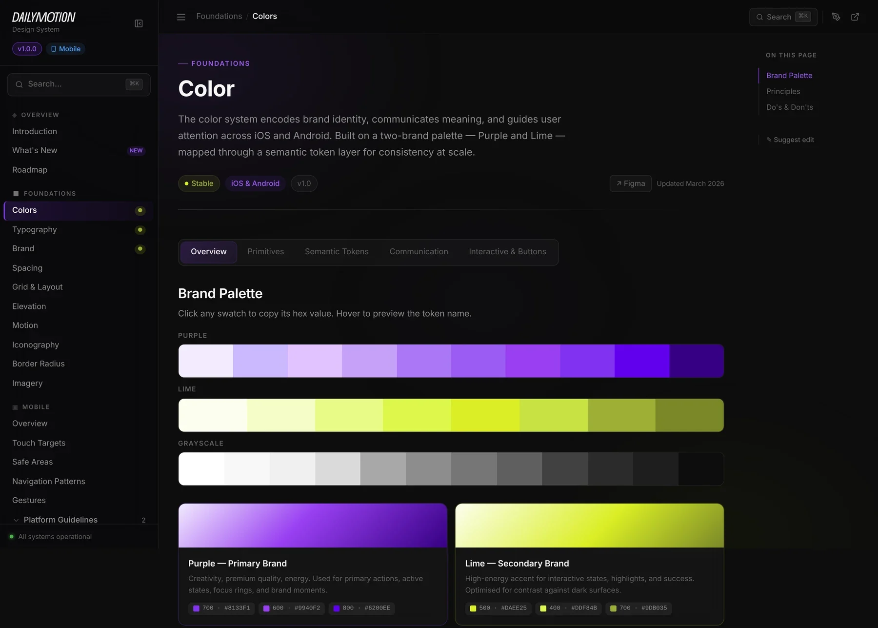
Then · after the rebrand, one Purple · Lime theme in one mode for native, in the system documentation (March 2026): 45 components, 10 foundations, 10 patterns.
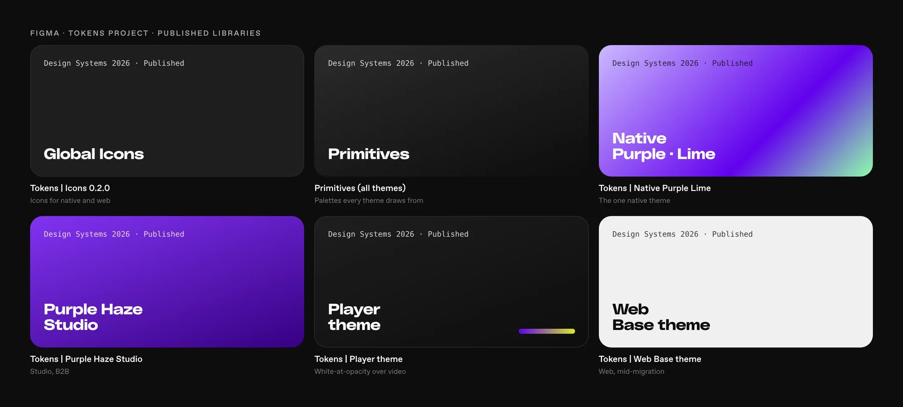
Every theme published in Figma as its own library, on shared primitives and icons. Concept view.
Colour Tokens
“Clean up styles on the design side, align naming and values with engineers.”
- Research
- Figma design
- Spec
- QA spec
- Tech docs
- Code
- Review
- Release
The epic template I set up for tokens, as a concept view: eight child issues that every component then followed.
A path every component follows.
Missing components were built locally, logged in Jira and added to a voted backlog. I set priority from those votes with the core contributors.
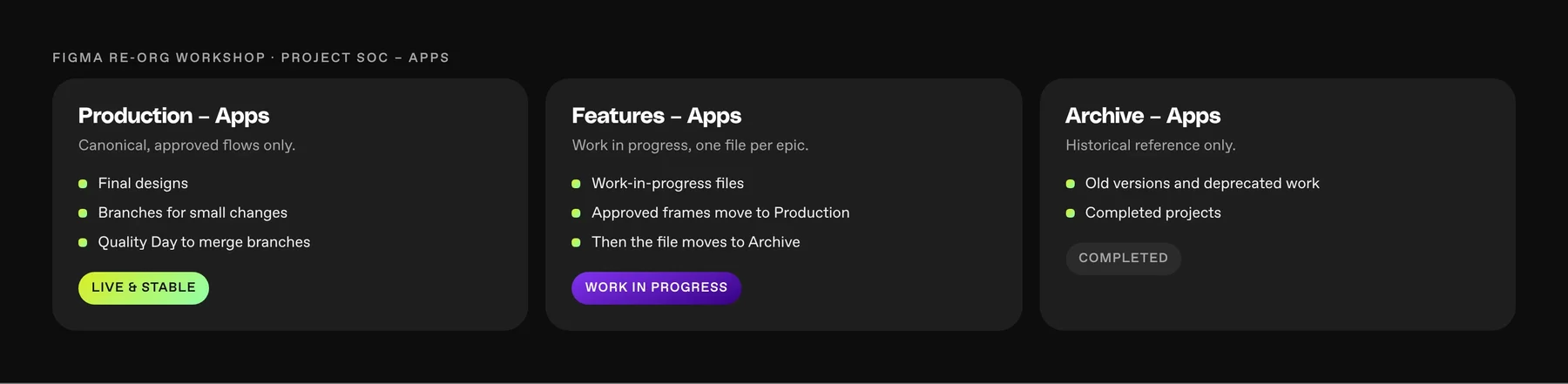
Files got the same rule: Production for what’s live, Features for work in progress, Archive for the rest. I ran it with every team lead in a 45-minute workshop. Concept view.
The brand changed under the system. We migrated.
Our palette, fonts and style came from the brand department, so the system depended on them. When they redesigned the brand, the core palette and type changed, and we had to adopt it. It wasn’t easy: we migrated from five themes in two modes to one Purple · Lime theme in one mode for native, with DailySans and ABC Favorit, led by the native app. Studio, Player and web keep their own themes on the same primitives.
Native first, web later. Web carried 20 years of code. I chose to prove the system where we could ship it in full, then move web screen by screen, starting with sign-up. The cost: two visual languages in production for a while.
Real screens and sheets from the native kit, played as the two core flows. Every surface, button and gradient comes from the Purple · Lime tokens.
Live components rebuilt from the kit with the same tokens: press the buttons, spend a boost, switch the feed, flip the toggles.
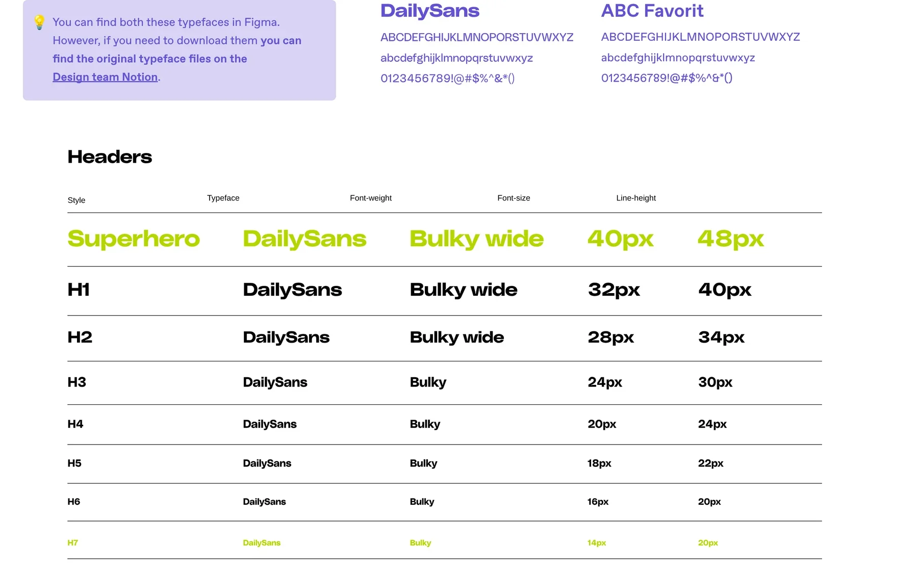
DailySans for headers, ABC Favorit for all body text.
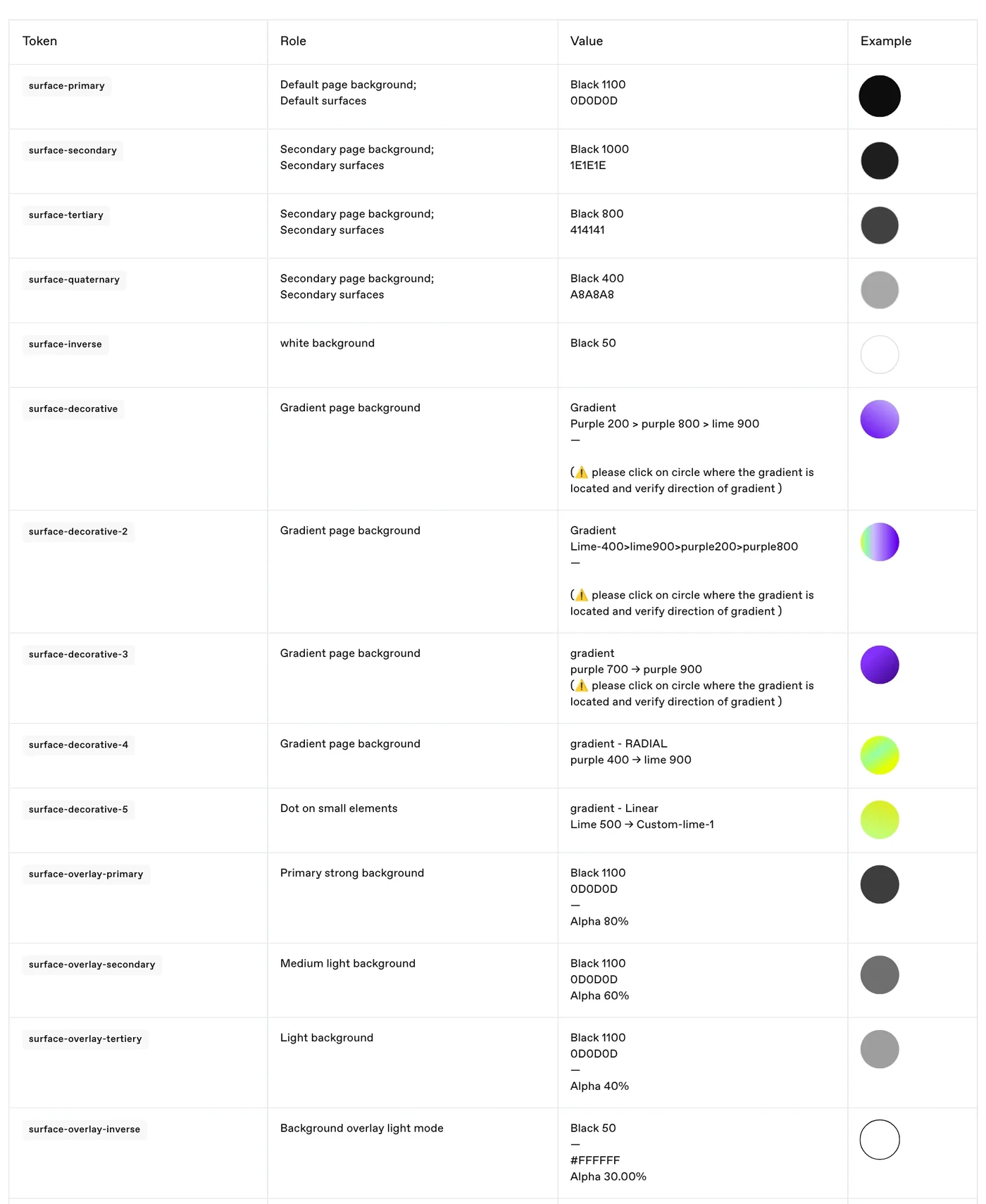
Semantic tokens: role → primitive.
Each designer owned a product. We owned the system together.
Every product had its own designer. I owned the system with them: tokens, components, files and reviews. Native and Studio moved onto it; web changed piece by piece, with the full migration planned. Below, real screens from the products, each on its own theme over the shared primitives.
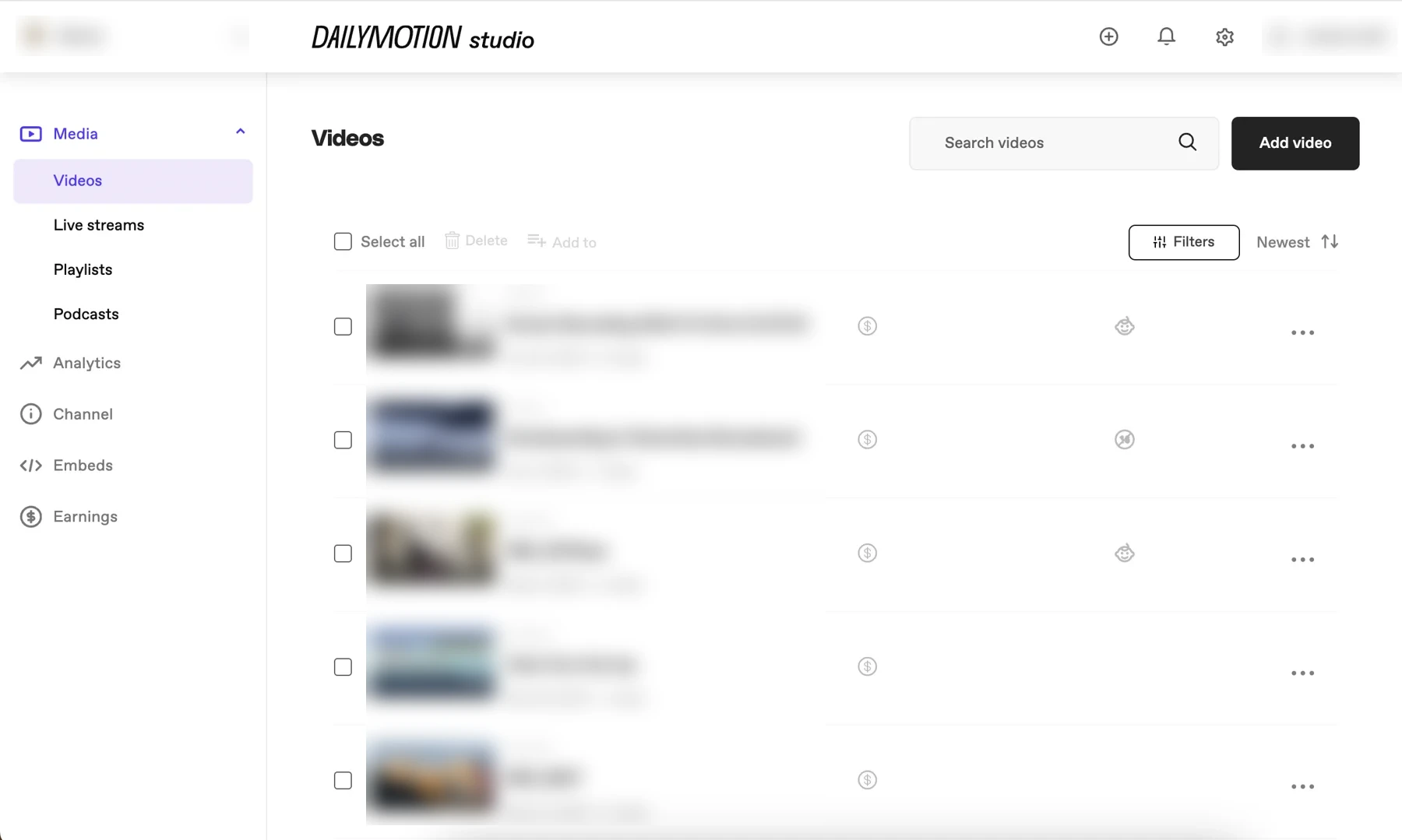
Studio · product design: Monia’s team. The Videos list on Studio’s Purple Haze theme.
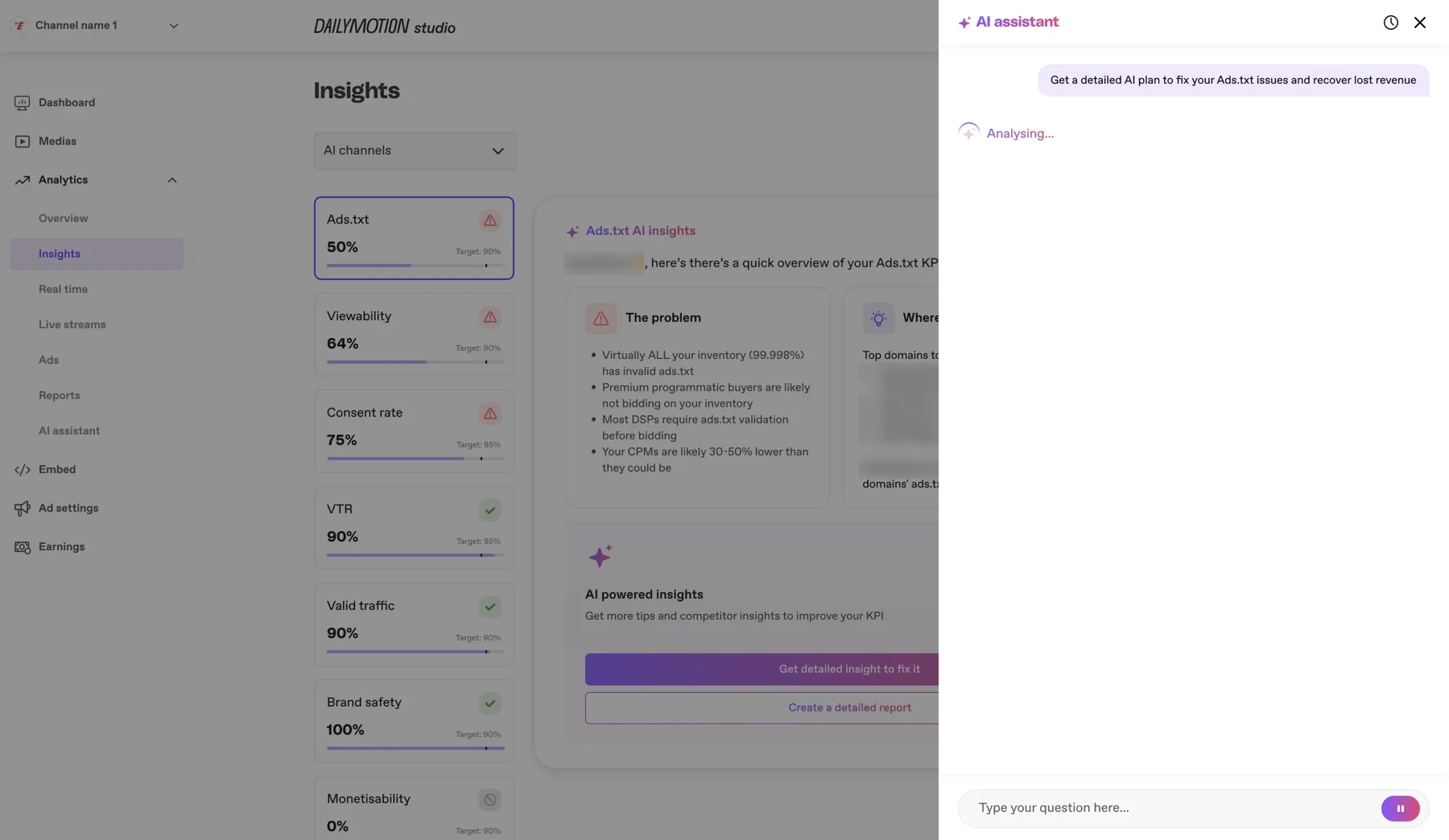
Studio AI Insights · Monia’s team. KPI cards, alerts and the AI assistant panel.
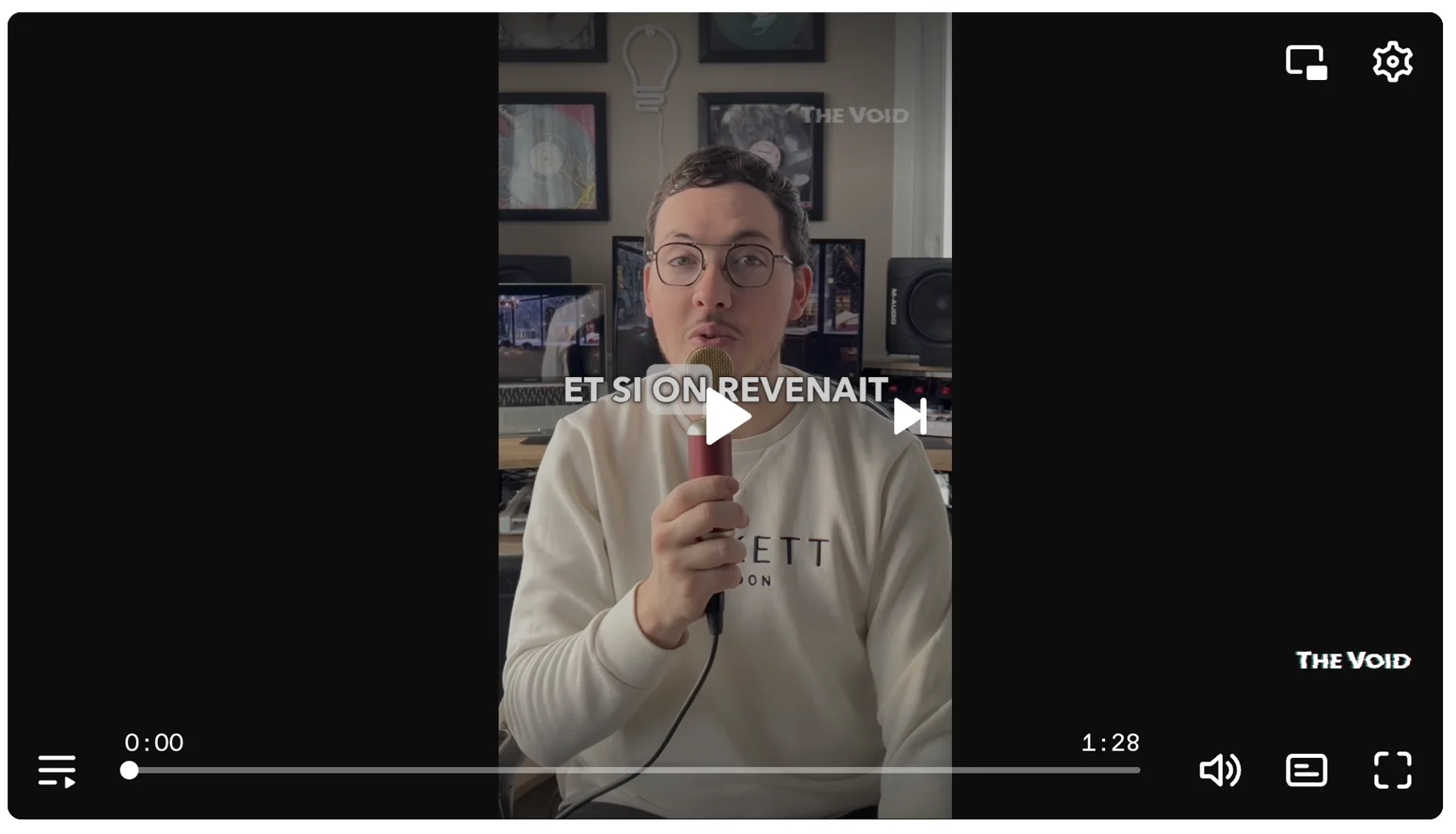
Player · product design: Nemanja. Controls on the Player theme over video.
From tool tests to systems an agent can read.
I tested the tools before choosing any, and set the principle: AI replaces overhead, not judgment. Every designer got Dust through Okta. I built agents on our design system, and every Friday I posted a 5–7 minute video on a small team channel: one week a Dust agent, the next an outside tool. I showed the native design agent at Dust Demo Day and at the company All Hands.
Core stack. Claude, Lovable, Bolt, UX Pilot, v0 and Figma AI were tested along the way.
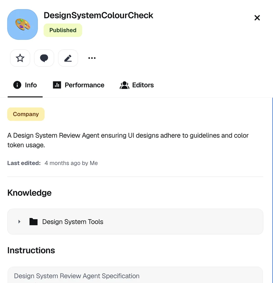
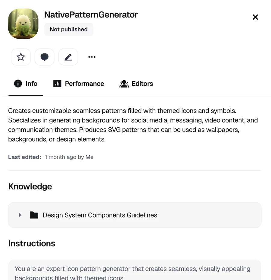
The two agents I built in Dust: a colour and token check, published company-wide, and a pattern generator for the native team.
From my tutorial video, April 2025: the agent reviews the native Boost component, flags raw colour values and names the semantic tokens and contrast fixes.
ThumbnailDesigner for Studio, July 2025: trained on about 90 files of Studio docs and screens, it turns a wireframe into on-brand 340×180 thumbnails ready for Figma.
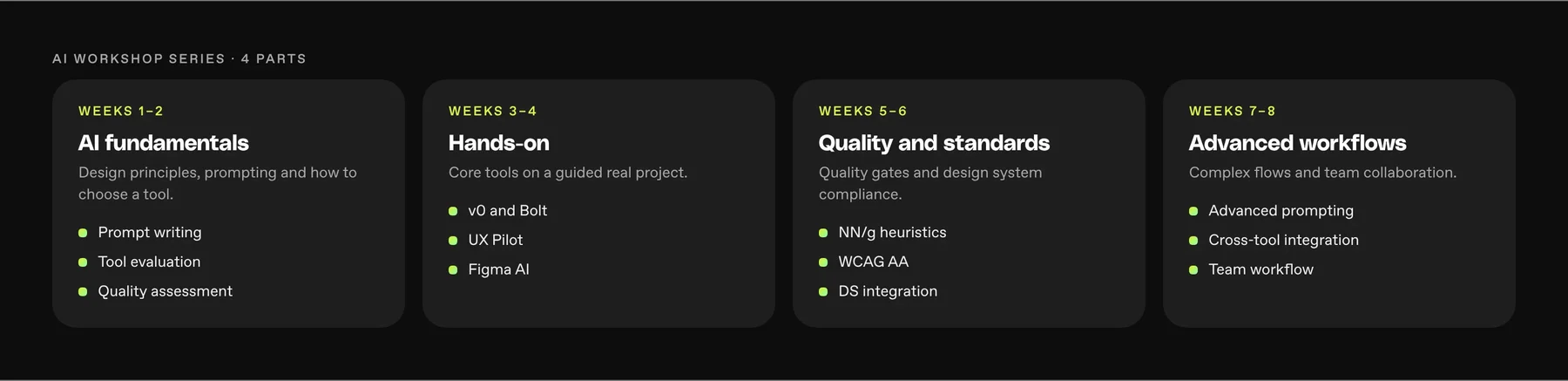
The AI workshop series for the design team, eight weeks in four parts. Concept view.
Friday channel · Q2 2025 · 5–7 minute videos
Experienced designers paired with newcomers: weekly check-ins, shadowing, mentoring.
Video tutorials, templates and a community Q&A.
Weekly time to try new AI tools and share what works.
The Friday channel in Q2 2025, tool weeks and agent weeks, with the support around it.
A system lives in code as much as in Figma. Next time I’d make a system engineer the first hire, and treat agent-readable docs as part of the system from day one.